|
Color Theory
All color theory is based on the principle that “color is light”. The colors we see are the result of a white light; when the white light is broken by a prism we see the spectrum. A rainbow is a common example of a spectrum and is the result of a raindrop acting as the prism.
An object seen as blue contains pigment which absorbs all of the colored rays of white light except the blue, which it reflects. A white object absorbs none of the colors in white light, so all the light is reflected back, black absorbs all the colors in white light and no color in the spectrum is reflected back to us.
The Color Wheel
 Painting a color wheel gives practice in recognizing color relationships, use of brushes and paint. The “star color wheel” is appropriate for older students and adults of varying abilities, a simpler color wheel configuration would be appropriate for younger students. Painting a color wheel gives practice in recognizing color relationships, use of brushes and paint. The “star color wheel” is appropriate for older students and adults of varying abilities, a simpler color wheel configuration would be appropriate for younger students.
A color wheel is laid out so that any two primary colors (red, yellow, blue) are separated by secondary (and tertiary) colors. Two primary colors mixed together will produce a secondary color (orange, green and violet) and tertiary colors that are between them on the color wheel.
The “star color wheel” has space for mixing 4 tints and 4 shades of each hue. Students may choose to extend the tints outward and the shades inward, or they may do the reverse.
TERMS:
|
hue-
|
the name of a color
|
|
primary colors-
|
red, blue, yellow are the primary colors, they cannot be mixed from other colors.
|
|
secondary colors-
|
orange, green and violet are secondary colors; they are mixed by blending two primary colors. Red and yellow mixed produce orange.
|
|
tertiary colors-
|
colors are mixed from an adjacent primary and secondary colors: i.e. reddish-orange and yellowish-orange, yellowish-green and blueish-green, reddish-violet and blueish-violet. They could just as easily be named orangish-red and yellowish-red, etc.
|
|
complementary
colors-
|
opposite colors on the color wheel that contrast each other the most extreme way because they do not have any color in common. A primary color is always complemented by a secondary color that is the mixture of the other two primary colors. On a color wheel complementary colors are always directly across from one another. Red and green, violet and yellow, and orange and blue are complementary to one another.
|
|
analogous colors-
|
are next to each other on the color wheel and have a color in common. Blue, violet and red are analogous because red and blue make violet.
|
|
monochromatic-
|
a theme of one color using tints and shades.
|
|
achromatic-
|
black, white and grays, without color.
|
|
tint-
|
a hue that has white added.
|
|
shade-
|
a hue that has black added (or a dark complementary color).
|
|
neutral colors-
|
also known as earth tones: all tints and shades of browns, tans, beiges, grays; earth colors can be mixed with all three primary colors together plus black or white, or by mixing complementary colors.
|
|
value-
|
the relative degree of light or dark
|
|
intensity-
|
the purity or strength of a color
|
|
cool colors-
|
remind you of cool things; blue, violet and green (i.e. cool water)
|
|
warm-
|
red, orange and yellow remind you of warm things (i.e. hot sun)
|
|
pigment-
|
a material that creates the effect of color on any surface. Traditional pigments were made from ground up minerals, plants and animal parts; modern pigments are chemically derived and are less expensive than ground up gold and lapis lazuli.
|
|
medium-
|
substance added to pigment to faciliate application; water is the medium for poster paint.
|
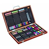
SUPPLIES:
-
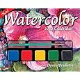
red, blue, yellow, white and black poster paint (known as tempera in the US); inexpensive poster paint is perfect in learning situations, invest in water colors and gouache (opaque watercolors) for more enjoyable materials,
-
watercolor brushes,
-
palette (a circular plastic palette with ‘wells’ make it possible mix base secondary and tertiary hues, shades and tints, and to save paint by covering with plastic wrap; if continuity is not a problem a paper plate will also work),
-
water and container(s) have several- one for wetting & cleaning brushes, one for fresh clean water and one for dirty water if a sink is not handy.
-
paper,
-
star color wheel template,
-
scrap paper for testing hues.
LESSON OUTCOMES AND OBJECTIVES:
Learners will be able to:
-
Define and show examples from the environment of color terms- primary, secondary, tertiary, intensity, hue, tint and shade.
-
Demonstrate combining of primary colors to create secondary and tertiary hues and adding black and white to all hues to create three graduated levels of tints and shades of each.
-
Compare and contrast the differences in color wheels using design terms.
LESSON ACTIVITIES:
Teacher defines and gives examples of color terms (orally and written) using a large color wheel and the current environment (clothing, furnishings) to identify colors. Include students in identifying examples of hue, primary, secondary, tertiary, tint, shade, warm and cool, analogous, monochrome, intensity, etc.
Teacher demonstrates mixing primary colors to achieve secondary and tertiary hues. This is also an excellent time to model appropriate painting techniques.
Because the area to be covered on the color wheel is very small it is not necessary to use large amounts of paint. Start mixing with small amounts and show how a very tiny amount of an intense color, such as red, blue or black, can quickly influence a larger amount of a less intense color such as white or yellow. Be sure to clean brush between colors in order to not contaminate the base colors.
HINT: Success in achieving the desired color is most easily attained by starting with a small dollop of the lightest color and adding small incremental amounts of the more intense color to reach the desired hue, tint or shade; i.e. to get pink, which is a tint of red, start with a teaspoon size dollop of white, dip just the tip of a small brush in the red and introduce it to the white paint. You will mix too much paint if you have to keep adding the dollops of the lighter color to the more intense color to get the tint you want. This can be a learning experience using inexpensive tempera paint. To get out of the problem take a very small portion of the color you have mixed and use that as the base.
Using a paper plate or palette have each student place evenly spaced dollops (one-two tsps.) of each primary color on palette.
Suggested methods for painting a color wheel vary with the amount of time/number of sessions available. If enough time (several hours) are available uninterrupted then all the colors can be mixed at once, if only short periods are available then a palette that can save the colors between sessions is advisable. When students are satisfied with secondary colors use a small amount of each secondary color to mix tertiary colors. Save small amounts of your secondary and tertiary colors from which to mix shades and tints.
SUGGESTIONS FOR EVALUATION:
REFLECTION: oral/written
-
Describe degree of satisfaction with process of creation and the product (the color wheel) that shows colors in pure intensity as well as gradients of shade and tint.
-
Participants compare and contrast their color wheels to show understanding of the terms and apply information in describing why individual color wheels vary.
-
Applying learning to creating a gradient landscape, a “my name” gradiation.
APPLICATIONS:
-
Execute work using analogous, complementary, monochromatic, warm, and cool color themes to demonstrate mastery of knowledge and techniques in
- - not recognizable as an object
|
- - a work of art depicting a scene such as valleys, mountains, rivers, forests; usually including sky.
|
- - a work of art of inanimate objects such as flowers, books, vases, bowls; usually refers to a work that is horizontally oriented.
|
- - a work of art representing a particular person (or animal) or group of people; usually refers to a work that is vertically oriented.
|
NEXT STEP: Put your color mixing skills to work- create a painting by precisely duplicating a simple landscape photograph such as advertising pictures from magazines or postcards.
-
Transfer the major lines of the photo to your paper with the grid method.
-
Cut a portion out of the central part of the photo, the size and placement of the portion will be dependent on the size of the photo.
-
Carefully attach the portion to a sheet of good quality all purpose art paper and lightly sketch the major lines and shapes,
-
Mix paint to match photo exactly and fill in around the portion you have attached to your paper.
-
Objective is to have photo portion be “invisible” in your duplicate.
RESOURCES:
|